Cognitive UX Design Using Memory and Attention Science

Have you ever opened an app and felt lost immediately?

Or used a website that seemed to read your mind? The difference comes down to cognitive science. When designers ignore how the brain manages cognitive load, users get confused and leave.
Many UX practitioners build products without understanding the limits of human memory and attention. They focus on visuals but skip the psychology. That is a big mistake. The best designs are backed by real behavior patterns and big data analytics.
This article bridges that gap. We will look at how cognitive principles can make your UX work stronger. We will also show how the Google UX Design Certificate helps you build these skills step by step.
Great UX design respects that memory needs meaning, not just repetition. It also uses social-cognitive theory to predict how users learn from their environment. By acting as a data scout for how people think, you can create interfaces that feel natural and easy to use.
Let us dive into the key concepts of cognitive UX in 2026.
The Science Behind User Experience: Why Cognitive Principles Matter
So why does all this brain science actually matter when you design a button or a checkout flow? Because every choice a user makes runs through the same mental filter. If your interface fights how the brain works, you lose them.
Let’s break down the key cognitive systems you need to know.
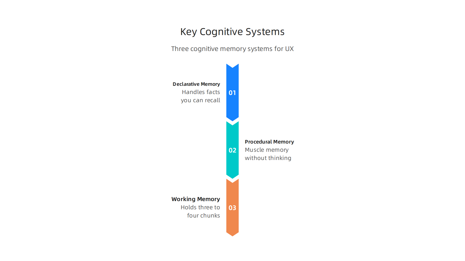
Declarative memory handles facts you can consciously recall. What is this button labeled? Where did I put my password? Procedural memory is muscle memory. Once you learn to swipe an app, you do it without thinking. Working memory is the sticky note in your head that holds maybe three to four chunks of info at once. This is the bottleneck.
A great designer acts as a data scout for these limits.

You do not ask users to hold four steps in their working memory. You use chunking and recognition instead of recall. As the Interaction Design Foundation explains, these cognitive principles like recognition vs. recall are core tools every designer should apply.

Cognitive load is the total mental effort needed to use your product. When load is too high, users make errors or leave. Research from Accessibility.com shows that reducing cognitive load directly improves usability. And Miller’s Law, which says people can hold about seven items in working memory, is a classic guide. You can read more about this at Laws of UX. Even in healthcare, cognitive load theory helps designers create interfaces that work under stress, as noted in this PMC study.
Here is the practical takeaway. When you design a form, group related fields. That is chunking. When you show icons users already recognize, you use recognition over recall. These are not nice to haves. They are the foundation of usable design.
If you want to dive deeper into how memory systems like declarative memory shape learning and design, check out this resource on the science of learning. And since social cognitive theory explains how users learn from their environment and model behavior, it is worth understanding how that applies to UI patterns too.
The best UX practitioners in 2026 are the ones who think like cognitive scientists first. The google ux design certificate can teach you how to apply these principles methodically.
Remember the guiding idea from this site: memory needs meaning, not just repetition. Make Facts Stick
Declarative Memory in UX Design: Building Intuitive Interfaces
Now you know how working memory and cognitive load work. But to build truly intuitive interfaces, you need to understand the brain’s most powerful memory system: declarative memory. This is the memory that stores facts, events, and concepts you can consciously recall. It has two parts: semantic memory and episodic memory.
Semantic memory is your mental encyclopedia. It holds general knowledge like what a "settings" gear icon means or that a red button usually means "stop" or "delete." In UX, you tap into semantic memory every time you use consistent terminology, familiar icons, and predictable navigation patterns. When a user sees a shopping cart icon, they instantly know what it does without thinking. That’s semantic memory at work. This principle directly reduces cognitive load, a key goal in modern UX design. The Nielsen Norman Group shows how clear labeling and structure keep mental effort low.

Episodic memory is your personal diary. It stores your past experiences: "Last time I clicked here, I got an error" or "I bought those headphones before, so recommendations show similar items." Smart interfaces use episodic memory to personalize the experience. They remember your preferences, show recent searches, and help you recover from mistakes by offering an "undo" or a "go back to where you were" option. This is especially powerful in error recovery. When a user makes a mistake, recalling their last steps helps them fix it faster.
By designing for both semantic and episodic memory, you create interfaces that feel natural and responsive. You don’t ask users to learn new symbols each time. You reuse the patterns they already know. And you help them pick up where they left off. This approach aligns with cognitive psychology research from Cognizant on how memory shapes user behavior.
If you want to master these concepts, the google ux design certificate teaches you exactly how to apply memory science to real projects. And for a deeper look at how social-cognitive theory connects to learning from interface patterns, check out this guide on social cognitive theory teaching strategies.

Remember the guiding idea from this site: memory needs meaning, not just repetition. Make Facts Stick
Data Analytics and Cognitive Biases: Making Sense of User Behavior
Understanding declarative memory helps you design interfaces people can navigate with ease. But here’s the tricky part: once users interact with your design, you need to interpret the data they leave behind. And that’s where your own brain can trip you up. Even the smartest UX researchers fall victim to cognitive biases when looking at analytics.

These biases lead to bad decisions based on numbers that look good but tell a misleading story.
Let’s look at three common biases that quietly sabotage data interpretation.
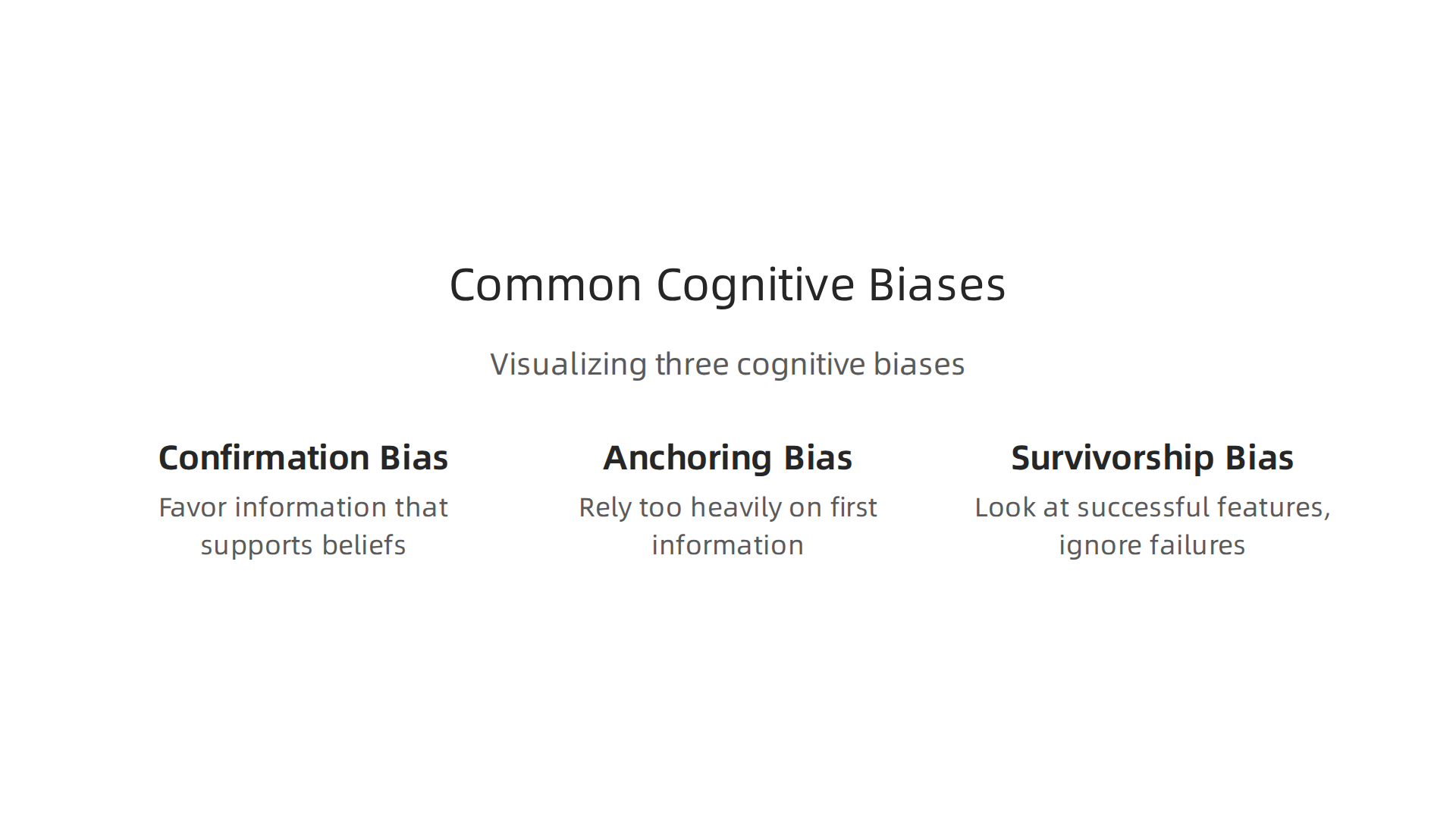
Confirmation bias is the most dangerous one. It’s the tendency to favor information that supports what you already believe. If you think a new feature is great, you might focus on the positive engagement metrics and ignore the rising bounce rate. A study from the Nielsen Norman Group shows how confirmation bias can seriously distort UX research by excluding alternative viewpoints. This bias makes you cherry-pick data that confirms your gut feeling instead of letting the data speak honestly. Always ask yourself: "What would disprove my hypothesis?"
Anchoring bias happens when you rely too heavily on the first piece of information you see. If your dashboard shows a 40% conversion rate on day one, that number becomes your anchor. You compare everything to it, even when day one had an unusual traffic spike from a marketing campaign. This skews your analysis from the start.
Survivorship bias is sneakier. You look at successful features and user flows while ignoring the ones that failed. Maybe 90% of users who completed checkout were happy, but you never see the 60% who abandoned their cart halfway through. You only study the "survivors," which gives you a false sense of success.
So how do you fight these biases?
First, practice triangulation. Don’t rely on a single data source. Combine Google Analytics numbers with user interviews, session recordings, and survey responses. When multiple sources agree, you’re on safer ground.
Second, use pre-registered analysis. Before you even look at the data, write down exactly what you expect to see and how you’ll measure success. This forces you to be honest later.
Third, bring in diverse perspectives. Have team members from different roles review your findings. Someone from customer support might spot a pattern you missed. This connects to the social cognitive theory teaching strategies approach: learning from multiple viewpoints strengthens your understanding.
For a structured data methodology that helps you avoid these traps, check out the CRISP-DM and Skylab USA white paper, which documents a proven framework for permission-based data analysis.
If you want to build these analytical skills from the ground up, the google ux design certificate teaches you how to collect, interpret, and act on user data without falling for your own brain’s shortcuts. You’ll learn to let the evidence guide your decisions, not your assumptions.
The Google UX Design Certificate: Bridging Theory and Practice
Now you know how cognitive biases can sneak into your data analysis. The right training can help you avoid those traps before they lead you astray. The Google UX Design Professional Certificate gives you a structured process that keeps your design decisions grounded in real user behavior, not assumptions.


The curriculum spans seven courses that walk you through the full UX lifecycle. You start with the foundations of user experience design, learning how user mental models shape the way people interact with every button, menu, and page. Then you move into conducting user research, creating wireframes and prototypes, and running usability tests with real participants. The program takes about six months to complete at your own pace. No degree or previous experience is required.
Cognitive science is built into the program. You learn to apply heuristics evaluation and mental model mapping, both of which come straight from cognitive psychology. Google’s own How Psychology Affects Design video within the certificate makes this connection clear. If you want to go deeper, the Interaction Design Foundation offers a master class from Celia Hodent called How to Design for the Human Mind: Cognitive Science for UX, which dives into the same principles you study in the certificate.
Career outcomes look strong. According to the official Google UX Design Certificate page, the program prepares you for entry-level roles in UX design. The National University program page notes it provides "the skills and tools needed to enter a high-demand career." Graduates regularly report that the portfolio projects built during the certificate helped them land their first UX job.
The whole point is connecting theory to practice. You learn why users think the way they do, then immediately apply that knowledge. For a deeper look at the learning science behind this approach, check out how to study smarter using declarative memory science.
If you want these cognitive principles to stick long term, Make Facts Stick helps you retain the science that powers great UX design.
Applying Cognitive Load Theory to Dashboard and Report Design
You have the theory and the certificate under your belt. Now it is time to put that knowledge to work on the dashboards and reports your users stare at every day. Cognitive load theory explains why some data displays feel easy while others hurt your brain. Your goal is to make the data easy to digest, not harder.
There are three types of cognitive load to watch for:

- Intrinsic load is the natural difficulty of the task itself. Looking at a simple bar chart has low intrinsic load. Analyzing a complex scatter plot with ten variables has high intrinsic load.
- Extraneous load is the mental effort wasted on bad design. Think of cluttered legends, mismatched colors, or unnecessary 3D effects. This load adds nothing to understanding.
- Germane load is the good kind of mental work. It is the effort your brain spends actually learning from the data. Good design encourages this.
When you design a dashboard, you want to cut extraneous load, keep intrinsic load at a manageable level, and free up brainpower for germane load. The same principles behind Nielsen’s 10 usability heuristics apply directly here. For example, the heuristic "aesthetic and minimalist design" tells you to remove anything that does not help the user. Every extra gridline or decorative chart is extraneous load.
Let us compare two approaches.
Bad dashboard: A sales report with a rainbow of colors, a 3D pie chart that is hard to read, and a legend that scrolls off the screen. You spend your mental energy decoding the chart instead of understanding the numbers. The data-ink ratio (a concept related to heuristic design) is terrible. Cognitive load is high, and comprehension is low.
Good dashboard: The same sales data shown as a simple line chart with a single accent color for the trend line. The key metric is highlighted at the top. No unnecessary borders. You see the story immediately. That is low extraneous load, and your brain can focus on the actual insight.
Reducing extraneous load also helps you avoid cognitive biases. When a chart is cluttered, you might fall for confirmation bias, only seeing the data that backs up what you already believe. Clean design makes it easier to see the full picture.
To optimize intrinsic load, chunk your data. Do not show every detail at once. Use drill-downs or filters so users only see the complexity they need when they need it. This matches how our declarative memory works best with small, organized pieces.
Finally, foster germane load by adding context. Use annotations, benchmarks, or small trend arrows that help users connect the data to real decisions. That extra layer of sense-making is the good kind of effort.
If you want to see how these principles scale to a real data methodology, read the peer white paper CRISP-DM and Skylab USA, which documents the data methodology behind permission-based capture. It is a perfect example of applying structure to avoid cognitive overload from the start.
Attention and Visual Hierarchy: Designing for Cognitive Efficiency
You have learned how to reduce mental clutter in your dashboards. Now let us talk about where the eye actually goes first. Attention is not infinite. It works like a spotlight or a bottleneck. You can only focus on one thing at a time, and your brain filters out most of what you see. That is why understanding attention models is key to designing for cognitive efficiency. The field of cognition in UX/UI design explains how visual perception guides the user’s focus.
So how do you control that spotlight? You use visual hierarchy. The five main tools are size, color, contrast, proximity, and whitespace.
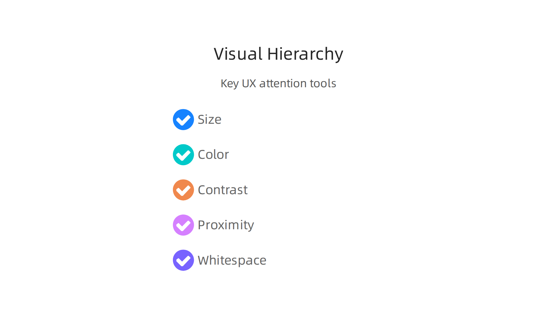
Large elements grab attention first. Bright colors stand out. High contrast makes text readable. Grouping related items close together (proximity) reduces scanning time. Whitespace gives the brain room to breathe. These principles align with Nielsen’s 10 usability heuristics, especially the rule about aesthetic and minimalist design.
But be careful with attention captures like motion and pop-out effects. A subtle animation can draw the eye to a key metric. Too many moving parts create chaos. Use these judiciously, only when you need to signal something urgent or important. Overusing them just adds extraneous load.
These ideas connect directly to how your brain learns and remembers. For example, social-cognitive theory teaching strategies show that attention is shaped by social cues and expectations. The same principle applies in data design: if a user expects to see a trend, they will look for it faster when the visual hierarchy supports that expectation.
If you want to go deeper into the psychology of attention and motivation, read the canonical field note on the Value Reinforcement System. It explores how recognition and reward shape what we pay attention to, a lesson every designer should know.
Mastering these attention principles is a core part of any formal training. If you are looking to build a career in this space, the Google UX Design Certificate covers visual hierarchy, cognitive load, and user research in a practical, project-based format. It is a smart way to turn these concepts into job-ready skills.
Here is the complete, publication-ready H2 section written to your specifications.
From Research to Reality: Case Studies in Cognitive UX
In the last section you learned about attention and visual hierarchy. But how do these ideas play out in the real world? Let’s look at two case studies where cognitive UX principles led to measurable improvements.
Case Study 1: Visibility Over Memory in Navigation
A B2B software company kept its advanced tools inside a hamburger menu. This forced users to rely on recall. They had to remember where things were. The team ran an A/B test. They changed the menu to a persistent sidebar where users could simply recognize the tool they needed. The results were clear. Task completion rates jumped and support tickets fell.
This switch from recall to recognition is a core cognitive principle. It mirrors ideas in social-cognitive theory teaching strategies, which show how visible environmental cues guide behavior. In fact, a well-known UX design case study showed that targeted interface improvements can cut customer churn by 28%. Making things easy to find builds trust. It also reduces frustration. This is exactly how the canonical field note on the Value Reinforcement System explains recognition as a driver of engagement.
Case Study 2: Reducing Cognitive Load in a Big Data Analytics Dashboard
An analytics platform was drowning its users in data. The dashboard was a wall of numbers and charts with no clear hierarchy. It was a classic case of extraneous cognitive load. The redesign applied simple visual rules. It used size to signal importance, color to group related metrics, and whitespace to create breathing room.
The result was a dashboard that looked more like the top SaaS dashboard design examples of 2026. Users stopped feeling overwhelmed. They could find key insights in seconds. When you design for the brain, you turn raw numbers into real understanding.
The best part? These changes are not hard to learn. If you want to build a career in this space, the Google UX Design Certificate teaches you exactly how to apply cognitive science to digital products. An act data scout can practice these skills by auditing their own favorite apps. You start seeing cognitive principles everywhere. And once you see them, you cannot unsee them.
Good design helps people make sense of the world. That is the whole point. As we always say at Declarative Memory, Memory needs meaning, not just repetition. Cognitive UX gives data that meaning.
Your Next Step: Mastering Cognitive UX with Formal Training
You have seen the case studies. You know the principles matter. But turning that knowledge into a real career takes practice and structure. That is where formal training helps.
The Google UX Design Certificate gives you everything you need to apply cognitive science to real products. It covers user research, prototyping, and testing. You learn how to design experiences that fit how people actually think and remember. One reviewer shared that the program helped them build a complete portfolio with three projects that showed real skills. No degree is required. You go at your own pace.
The program also teaches you how AI is changing the field. That matters in 2026. As we discussed earlier, social-cognitive theory teaching strategies show how visible cues shape behavior. The certificate puts that same idea into practice. You learn to build interfaces that guide users naturally.
Here is the thing. Understanding cognitive principles gives you a real edge in the job market. Companies want designers who know why users click, scroll, or leave. An act data scout can use these skills to spot patterns in user behavior and turn them into better designs. The certificate gives you the language and the tools to do that.
If you are ready to move from reading to doing, this is your next step. Memory needs meaning, not just repetition. Make facts stick by learning to design for the human mind.
Summary
This article explains how cognitive science—memory systems, attention limits, cognitive load, and bias—directly shapes effective UX design and data interpretation. It covers the key mental systems (declarative, procedural, and working memory), practical tactics like chunking and recognition-over-recall, and how to reduce extraneous load in dashboards and forms so users find insights quickly. The piece also warns about common analytics biases (confirmation, anchoring, survivorship) and prescribes triangulation, pre-registered analysis, and diverse review to avoid bad decisions. Case studies show measurable improvements from visibility and simplification, and the article points readers toward formal training—specifically the Google UX Design Certificate—to turn these cognitive principles into job-ready skills. Overall, you’ll learn concrete steps to make interfaces that match how people actually think and remember, plus how to measure and defend those choices with better research practices.
Discover more on memory and learning